

Based on the User Research that I've conducted, I have designed feature adds that include "Add Routes/Favorites" and a widget for users to see incoming buses. This is for San Francisco locals, tourists, and people across different cultural/socio-economic backgrounds, and accessibility needs.
View PrototypeMuni is the main transportation in San Francisco. I grew up riding the Muni bus and because of it getting around the city not only helped accommodated for me, but for many others such as those that are disabled, low to high income families, migrants, and visitors which in turn builds and enpowers stronger communities. The main focus of this Feature Add is to continue cultivating a safe space for our diverse community and to continue to be a reliable resource for the people of San Francisco and visitors as well. Muni has been a welcoming means to get from point A to point B and that is what I'd like to translate into the app based on the research that I've conducted.
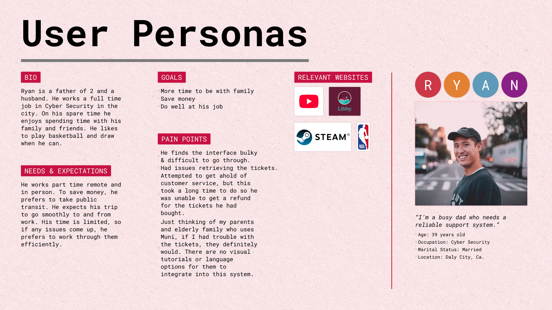
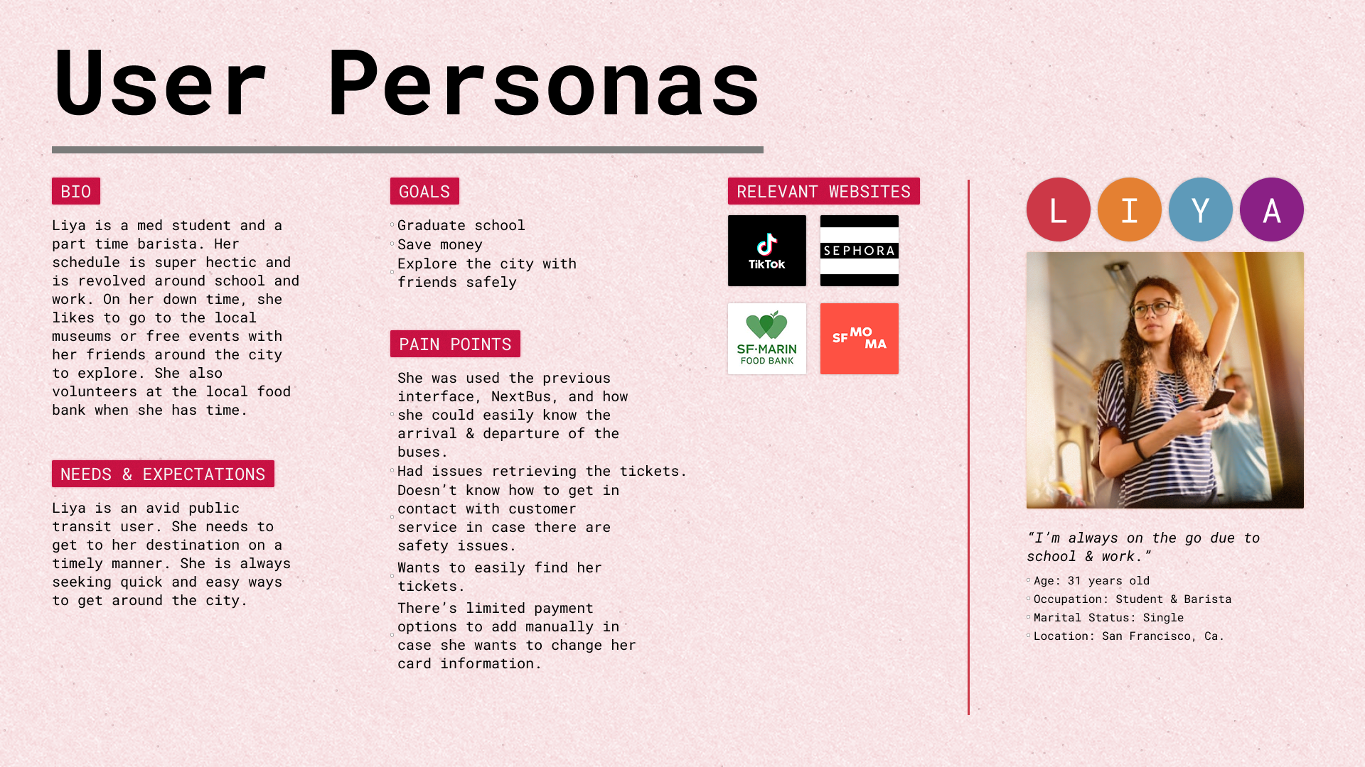
Based on the Muni Mobile App ratings and reviews, the overall score is a 2.1 out of 5. With this score, there seems to be an underlying source of misconnection with the users and the app. To uphold a reputable and trustworthy product for the community, there should be a deeper dive into what features can be added to enhance the full process from purchasing tickets to awaiting a busline and if this will help improve the overal ratings/ score.
Get a better understanding of how users interact with the app & find out if adding features can create a better connection to the community of transit users.
Click to enlarge, then click again to zoom in
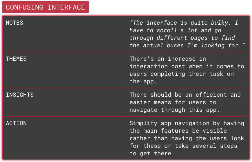
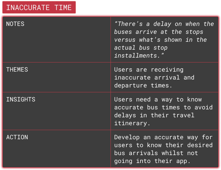
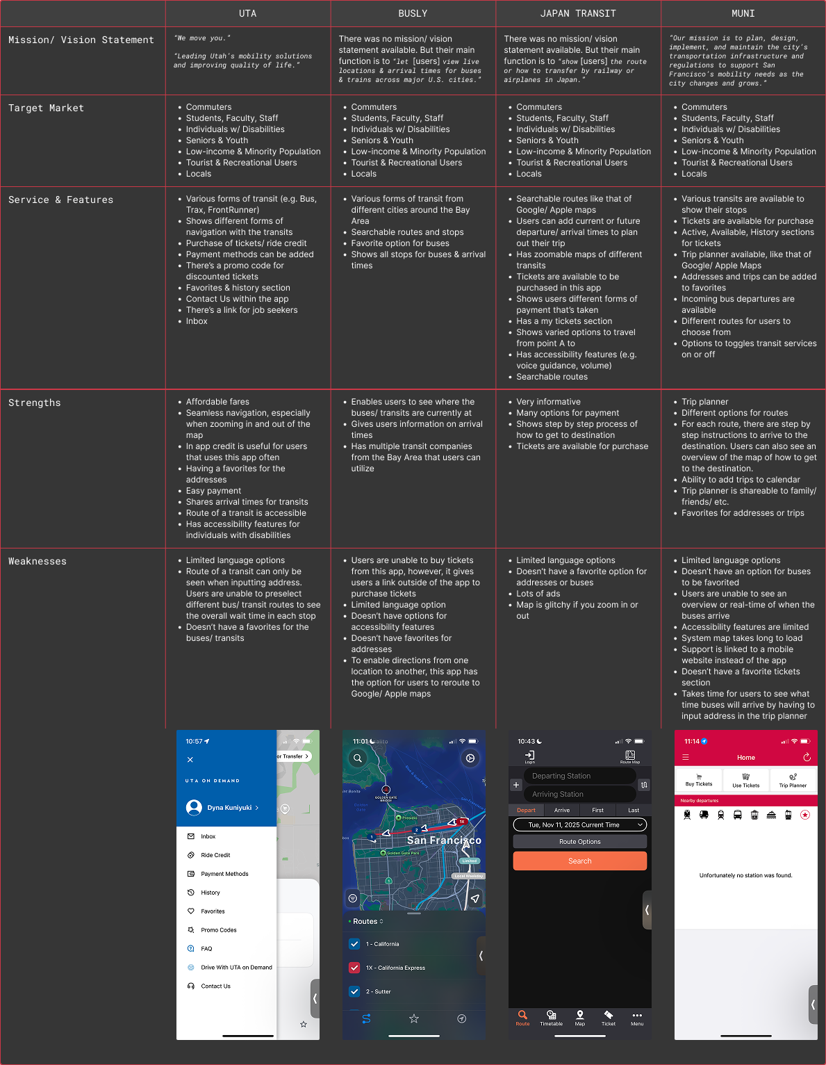
The first direction was having the incoming bus ride times be more easily accessible within the app. However, upon further research using competitive analysis and the insights from the user interviews, there were other apps such as the NYC Transit that utilizes the widget for users to see their incoming buses easily and efficiently.
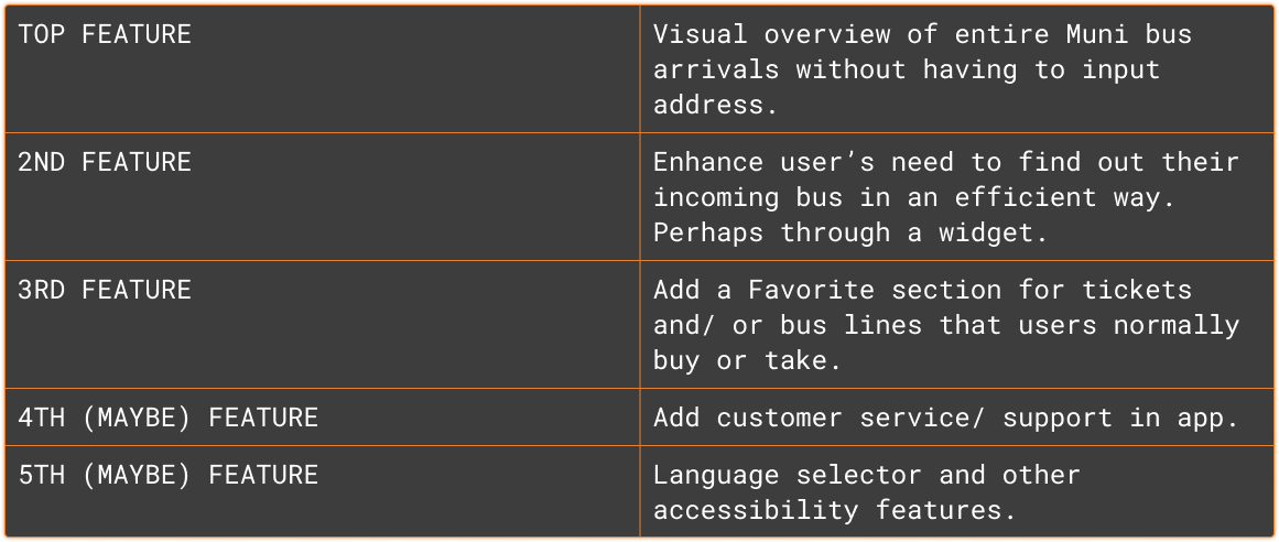
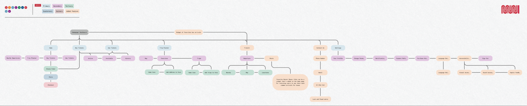
Bringing in all the data from the research, the following process was to focus on the first three features. Mainly, it would be best to structure how to add a route in an understandable and intuitive manner for users. Then introducing the widget where users are able to see their save route or bus lines. This step of creating the Site Map and User Flow needed to be very detailed and meticulous in order for the the new features to be implemented seamlessly.
"The interface is quite bulky. I have to scroll a lot and go through different pages to find the actual buses I'm looking for."
"There's a delay on when the buses arrive at the stops versus what's shown in the actual bus stop installments."
Click to enlarge
Click to enlarge
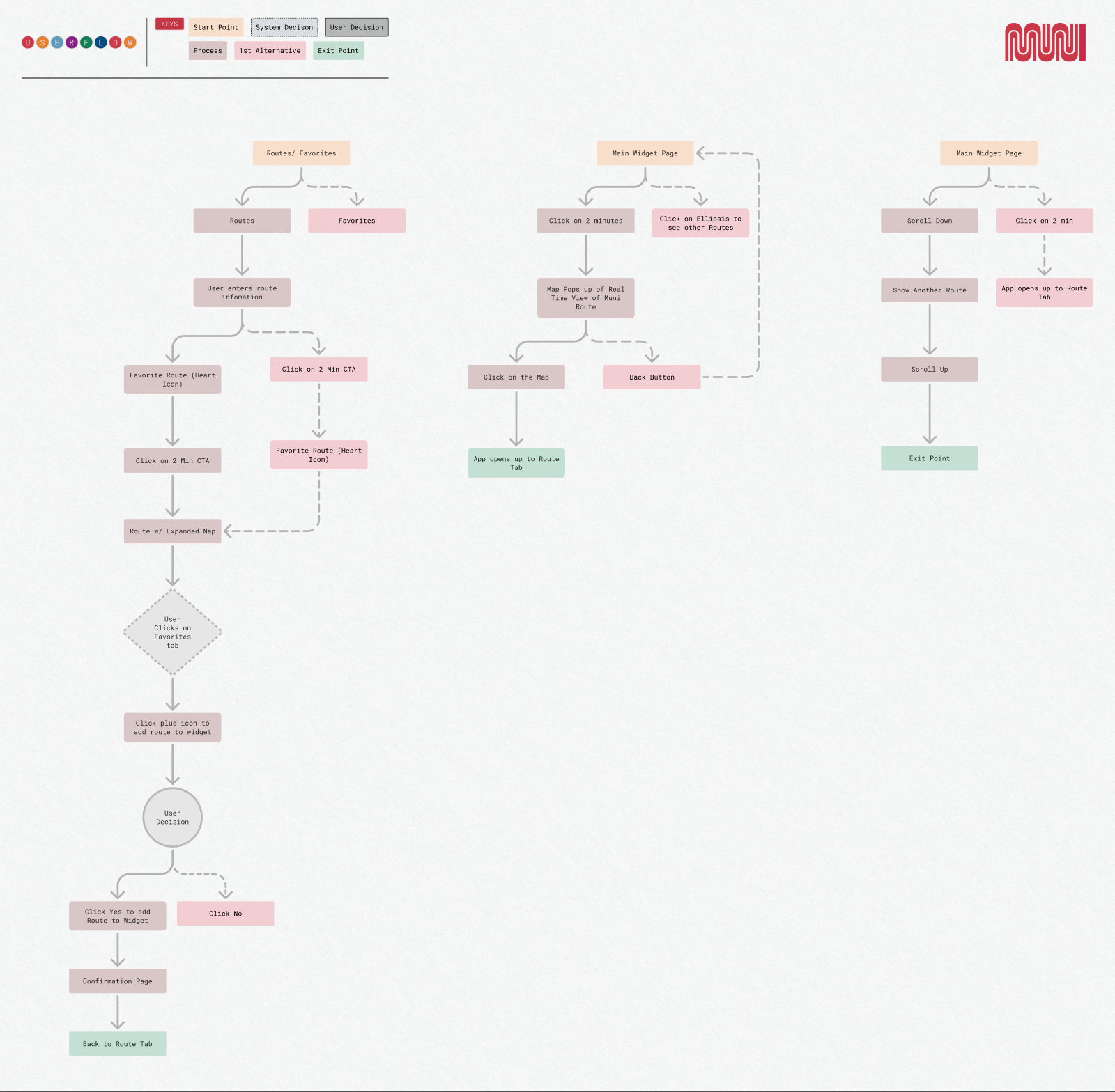
1. Routes/Favorites
2. Routes
3. User enters route information
4. Favorite Route (heart icon)
5. Click on "2 min" CTA
6. Route with expanded map
7. User clicks on Favorites tab
8. Click plus icon to add route to widget
9. User decision
10. Click "Yes" to add route to widget
11. Confirmation page
12. Back to Route tab
1. Main Widget Page
2. Click on "2 minutes"
3. Map pops up — real-time view of Muni route
4. Click on the map
5. App opens to the Route tab
Click any screen to enlarge
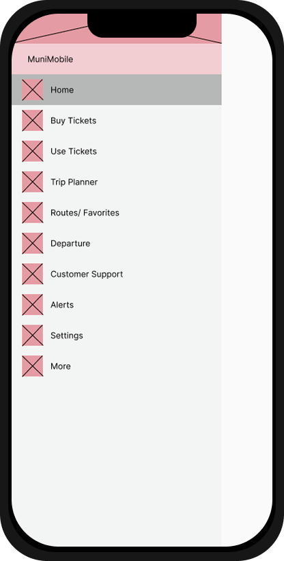
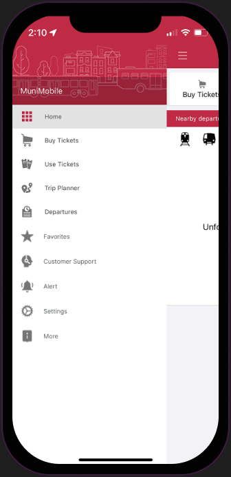
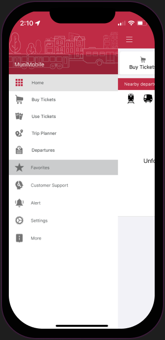
After the users will click on the hamburger icon, they will see a pop up of navigation options to go to. Based on the feature adds from the research, I'd added a favorites tab so that the buses or routes that are favorited will have a home.
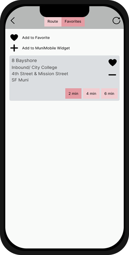
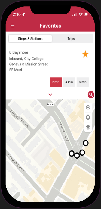
After a user clicks on Favorites, this will take them to the routes, stations, trips that were favorited. That way they can easily see what they've added and this can be automatically added to the widget.
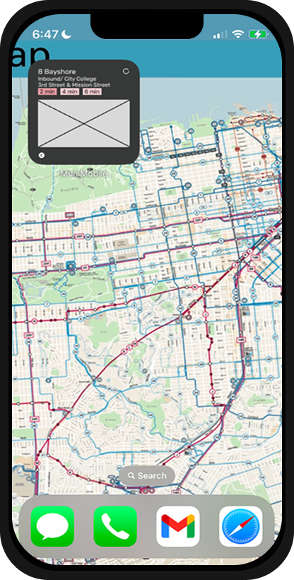
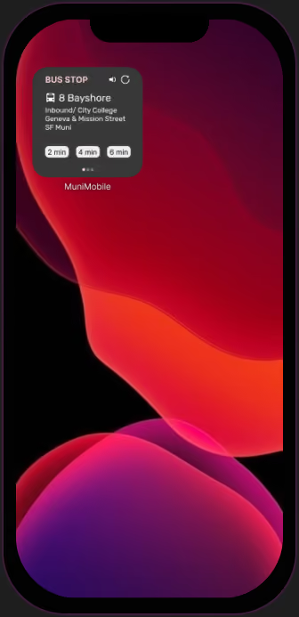
This takes me to the 3rd screen, which will be outside the app. This is the 'Widget' screen. This shows that widget that didn't exist prior to the research that were conducted. This widget gives users ease of use when anticipating when the next bus will arrive. They are also able to refresh to receive real time updates of their favorited bus line/routes.
Adding favorites to the Widget had the most errors/confusion due to the legend section. Second-most was the Routes/Favorites feature. All users completed all flows successfully.
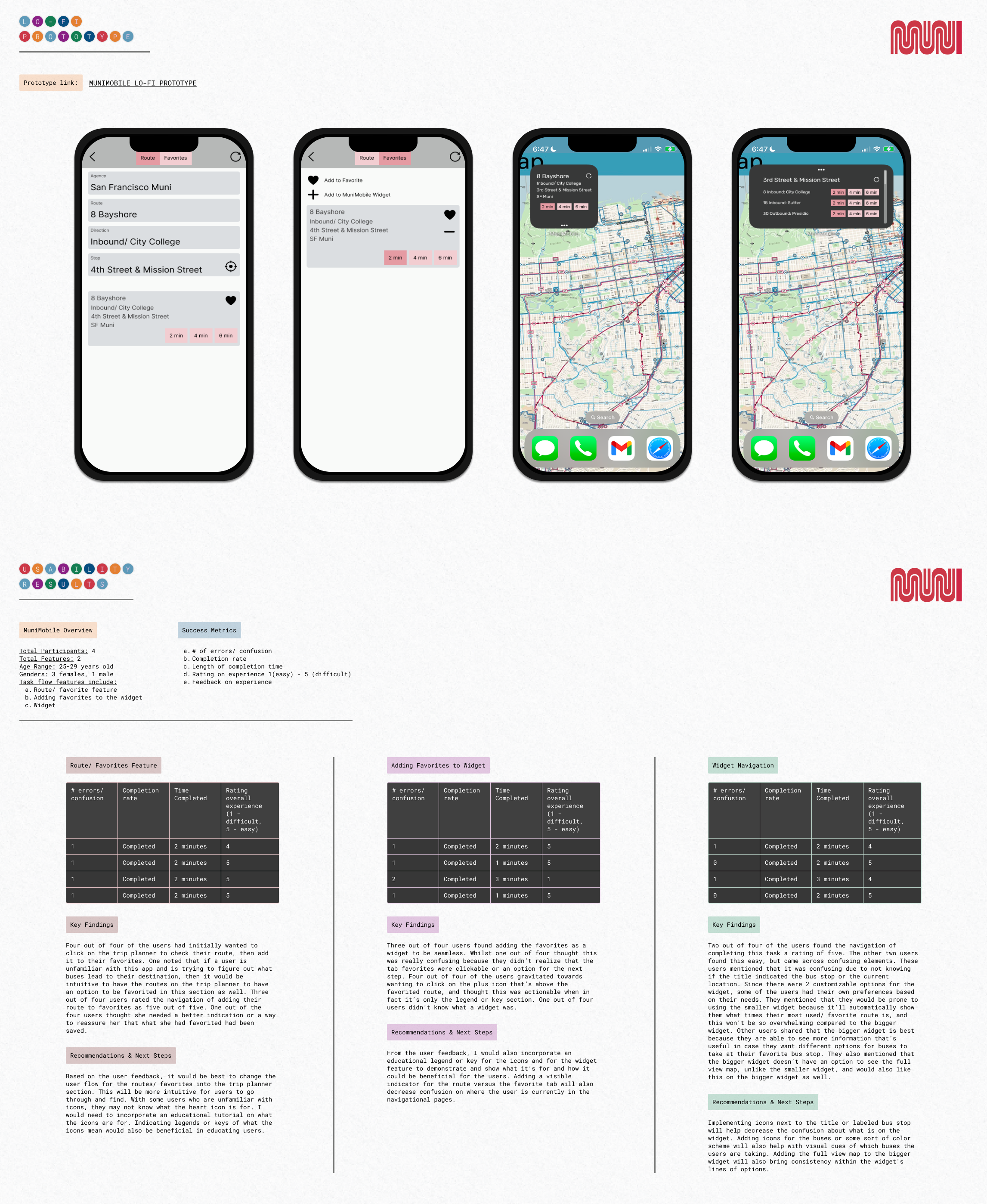
Click to enlarge, then click again to zoom in
Revisions
First we'd like to remove the routes/favorites feature and instead add this to the trip planner section for a more intuitive experience and minimize steps.
There was a lot of confusion on how to add the favorites into the widget. Based on this, it's best to automatically have the favorite bus line/bus stop auto populate on the widget.
If a user wants to customize their widget, they can click on the favorites section.
More users will utilize the app, in which case this will build loyalty between the riders and Muni. In return this will also be useful because the Muni app will be more accessible, especially since this will have a widget feature to readily see the incoming buses.
Next Step: A/B Test Plan
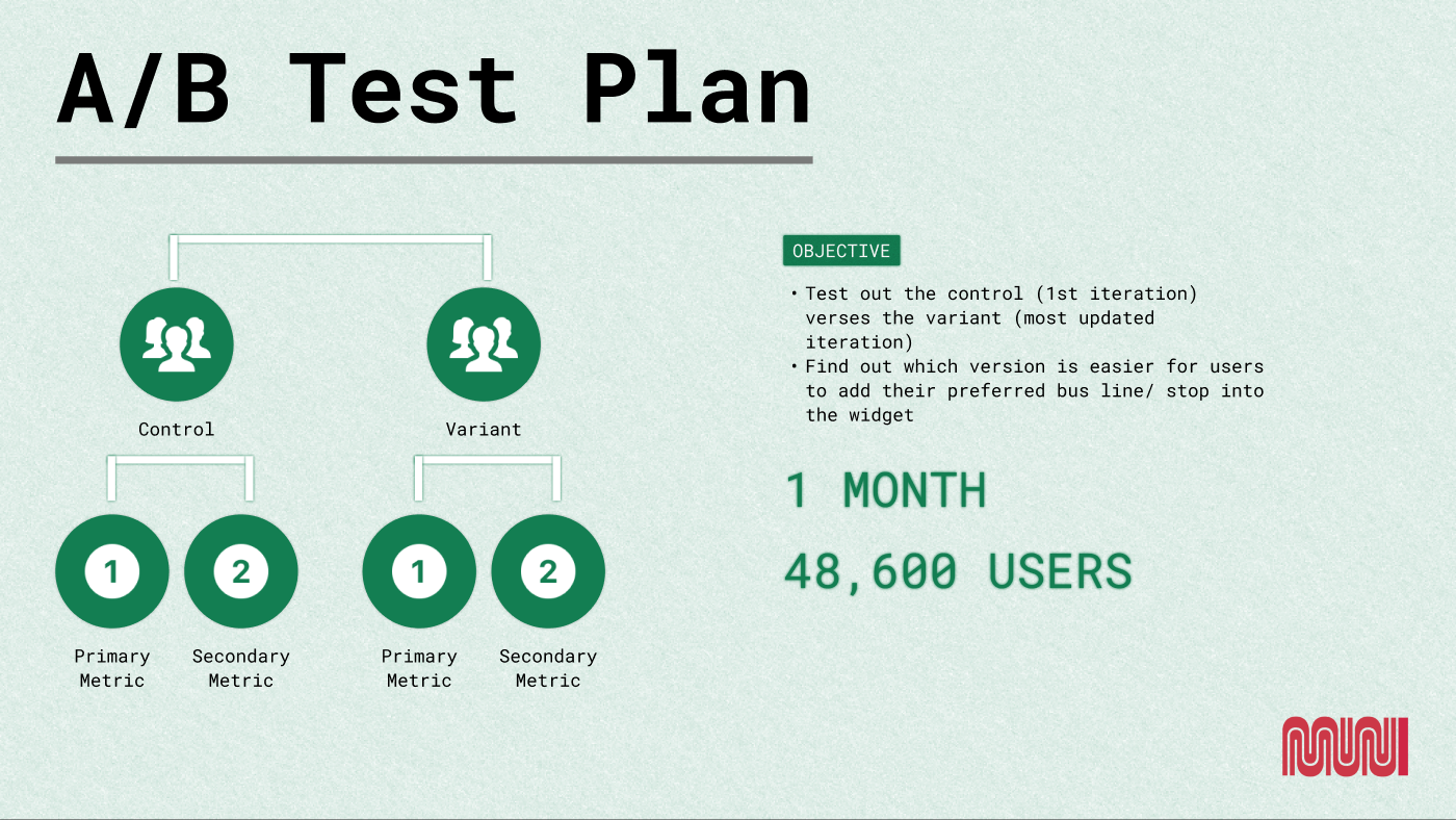
Hypothesis: "If we implement a simple way for users to see their incoming bus arrivals without having to type in their trip each time, then we will see an increase in user rates who'll utilize the Muni Mobile App."
We'd start by implementing this A/B test plan with 2 groups — one testing the first redesign of the feature, the other testing the new, updated iteration.
Primary Metric — Adding Widget Completion Rate: the percentage of users who favorite/save their preferred bus station & bus line to the widget. Goal: users save their preferred bus station & bus line to the widget, giving the app relevance and differentiating it from competitor apps.
Secondary Metric — Error Rate: the frequency of errors or technical failures users encounter on a page. Goal: surface additional errors preventing users from successfully adding their preferred bus stop & bus line to the widget, to inform solutions for the next iteration.
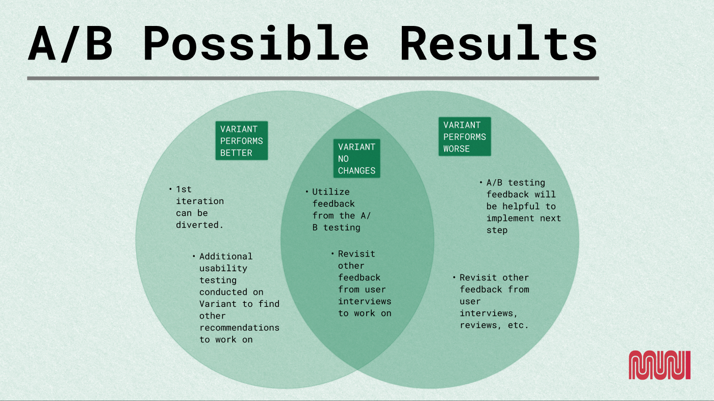
Possible Results
Performs Better: Version B performing better means the first iteration of the widget can be retired. Additional usability testing could then continue on Version B to keep finding ways to make navigation more seamless.
Performs Worse: if Version B performs worse, the feedback from the A/B test gets implemented and other solutions get revisited to improve app performance.
No significant change: if there's no significant change, feedback from the A/B test plus other issues surfaced in the user interviews get revisited next — aiming for a more significant improvement.
What I learned about designing a feature on the Muni Mobile App was how connected I felt about the app because I have lived experience with the Muni transit system. I still have family and friends who use this public transportation and this helped me empathize with the users even more on how the app should be more user/human centered. Muni is for the people and having a digital platform should also reflect that type of inclusivity.
What I would do differently is working on making the widget look more cohesive and interactive. The UI side could definitely use a bit more improvement from what I currently have designed.
