

[Add your hook line here — one sentence on what you designed, and for whom]
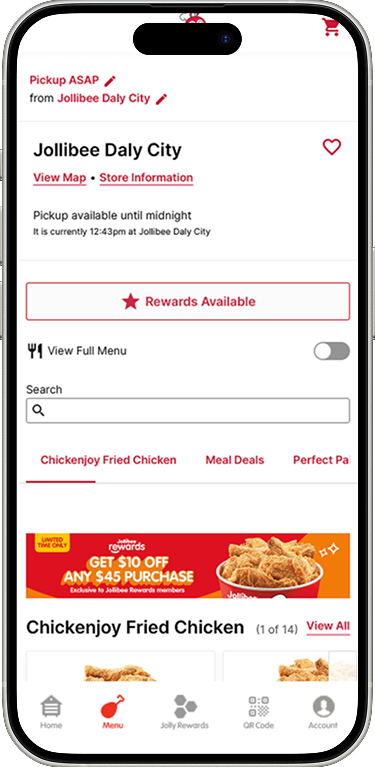
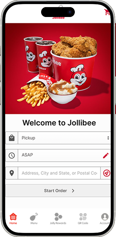
[Placeholder — rewrite in your own words. Research surfaced three core problems: users couldn't find the deals and promotions section, the rewards program required a long detour through the hamburger menu, and redeeming a deal meant being redirected outside the app to log in again.]
"4 out of 5 of the users from the user research had difficulty finding the deals and promotions section."
"the menu isn't seen right away and takes a while to get to"
[Placeholder — your own words on the business consequences: retention, satisfaction ratings, and brand perception, tied to users switching to competitor platforms.]
[Placeholder — rewrite in your own words. Five interviews conducted 6/18–6/22/2025, participants ages 30–34, exploring why customers use the app, pain points, usage patterns, and why some customers don't use it at all.]
On not using the app: "Doesn't use it. Because there hasn't been any promotional deals."
On the learning curve: "getting used to technology"
On what's working: "seamless," with menu items reachable via "one page with different categories"
On the rewards system: "You have to navigate to a different page...hard to find"
On the visual design: "outdated"
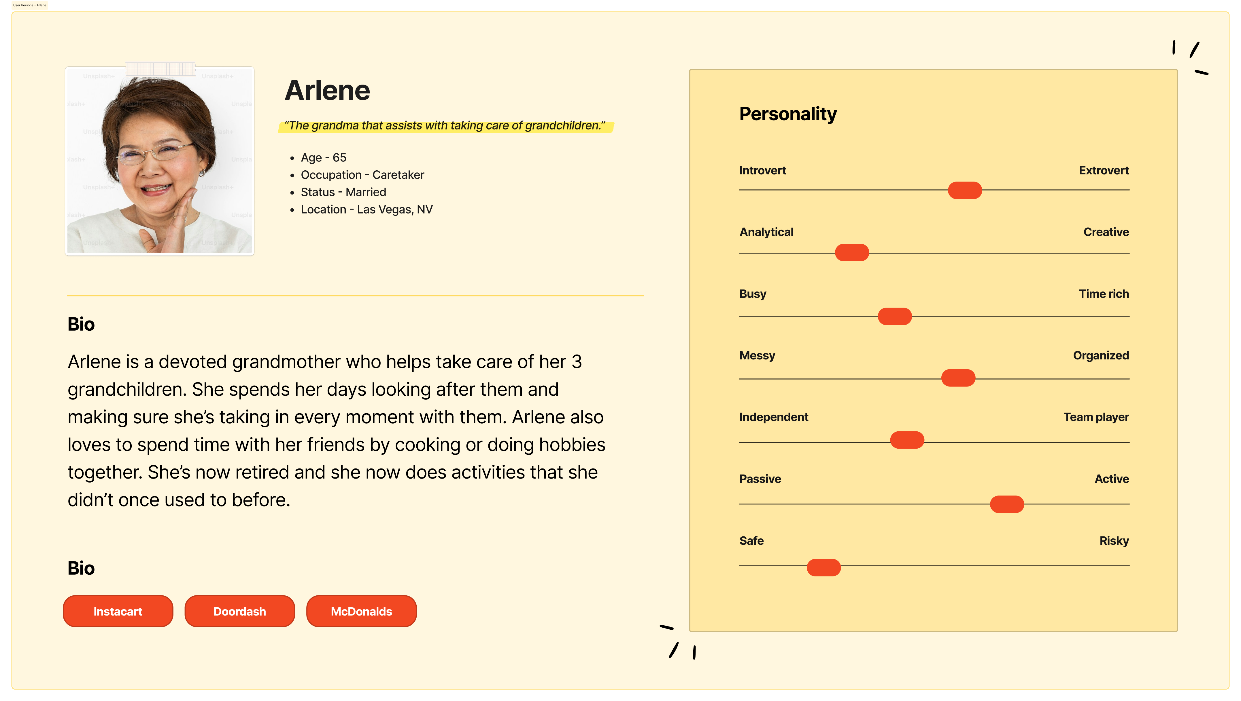
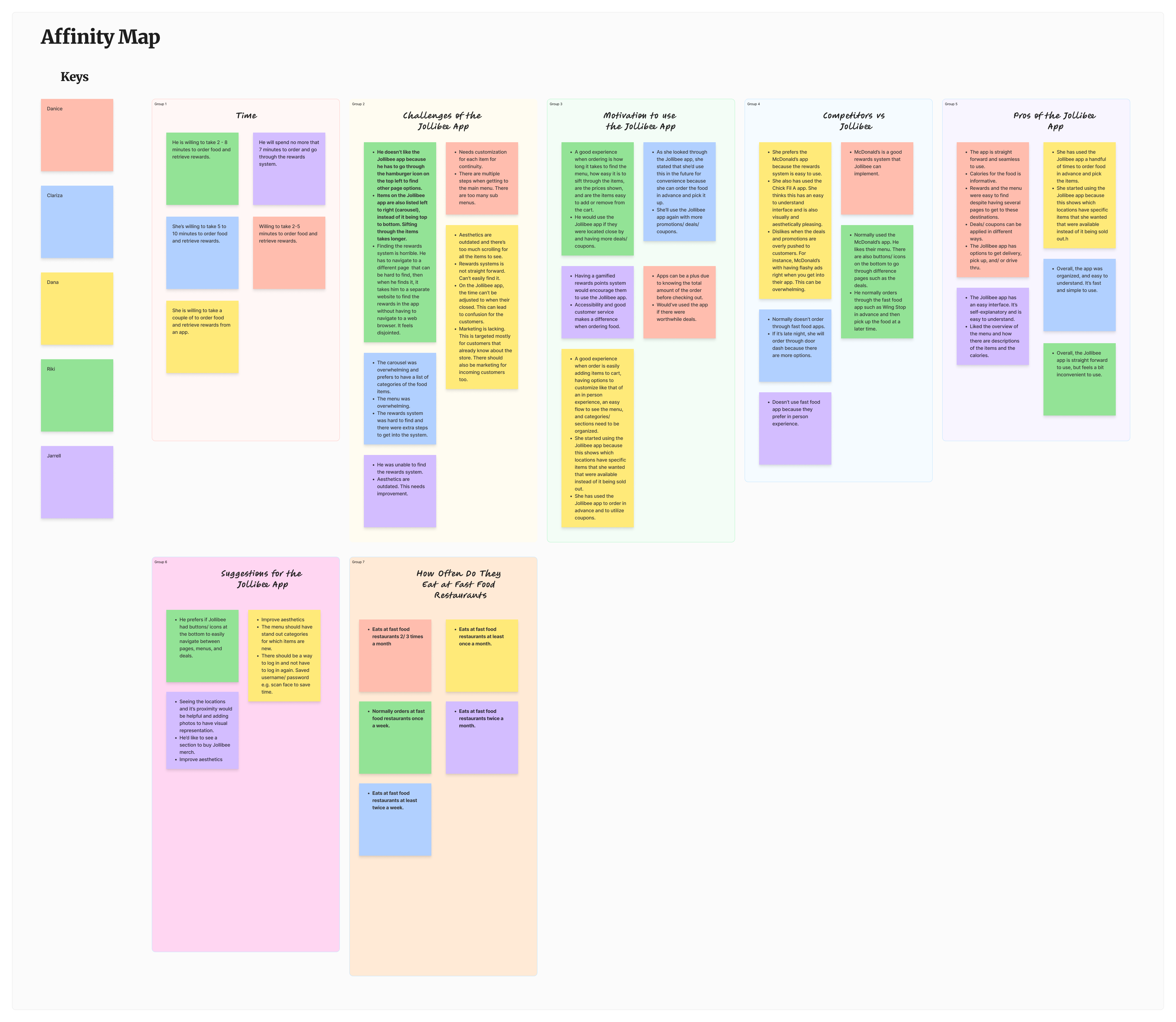
Click to enlarge
.png)
Click to enlarge
"I had initially thought that working on the menu would be the best route to go through. However, after the user research, I figured that it would be best to create a navigation bar feature."
Jollibee Rewards — bring the rewards program into the app, remove the browser redirect. Research: all participants had trouble finding this feature; competitors like McDonald's and Chick-fil-A were noted as more intuitive.
Bottom Bar Navigation — replace the hamburger menu. Same research backing.
Menu redesign/aesthetics — the app "appears outdated."
Location photos — help users visualize restaurants.
Meal customization — dietary preferences, matches the in-person ordering experience.
Merch sales — a revenue-stream idea suggested in a user interview.
Click to enlarge
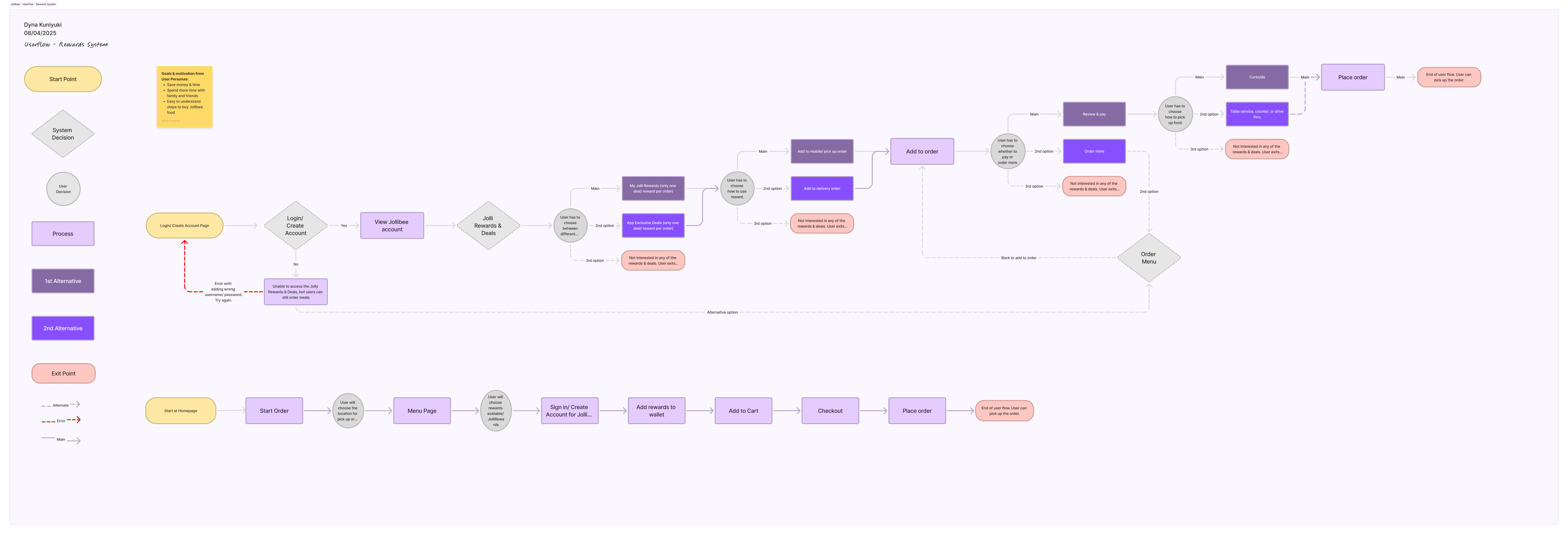
The first image showcases the initial user flow for the Jollibee app. The second image will be the lo-fi wireframe sketches of the Jolly Rewards & Deals system.
"This main page will also include the new feature, which is the bottom navigation. This will include 5 icons. The first is the house icon and this symbolizes the main page. The second is a bucket of chicken wings, which is the menu. The third is a pie icon and this is the rewards and deals section. The square icon is the QR code that users can use when they are at a restaurant when ordering food and they can accumulate points in their account. The fifth icon is the profile..."
"Using the user flow, the main task is to sign in at first. The users will only need to sign once if they would like to be a member of the rewards program. They won't need to sign in twice to save them time."
"Then this would open up the varying options such as start new order, account settings, and at the bottom is where the user would have to click on the 'Redeem Points' section. From the user research, this was difficult for some of the user to find and some weren't able to find this at all."
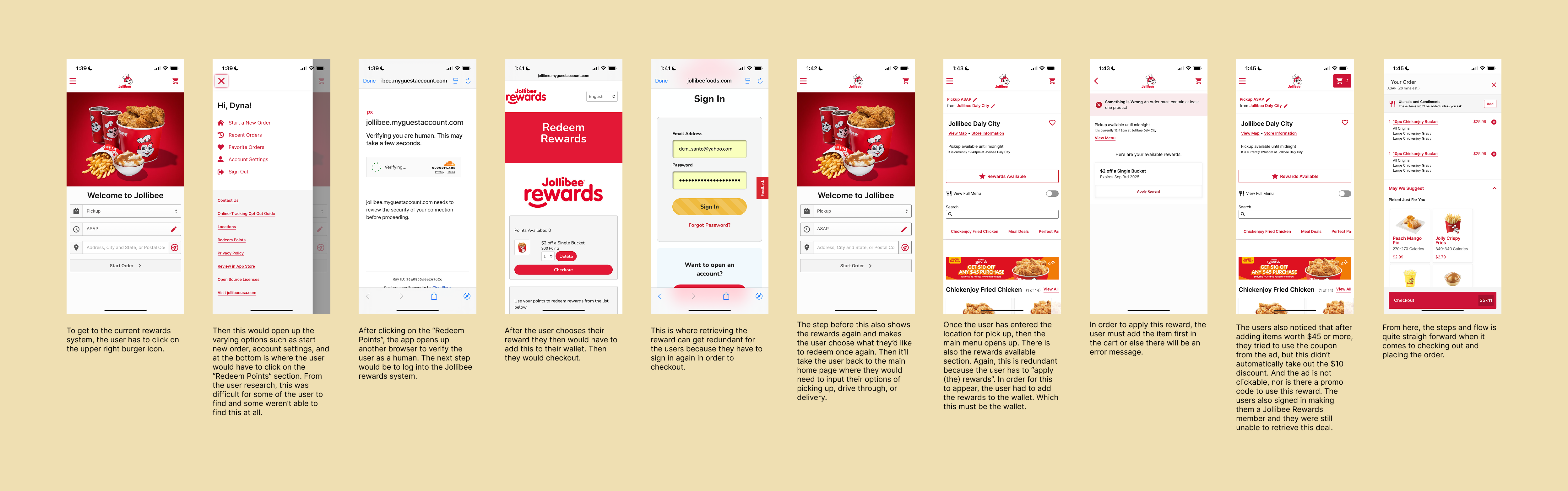
App flow (before update) — click to enlarge
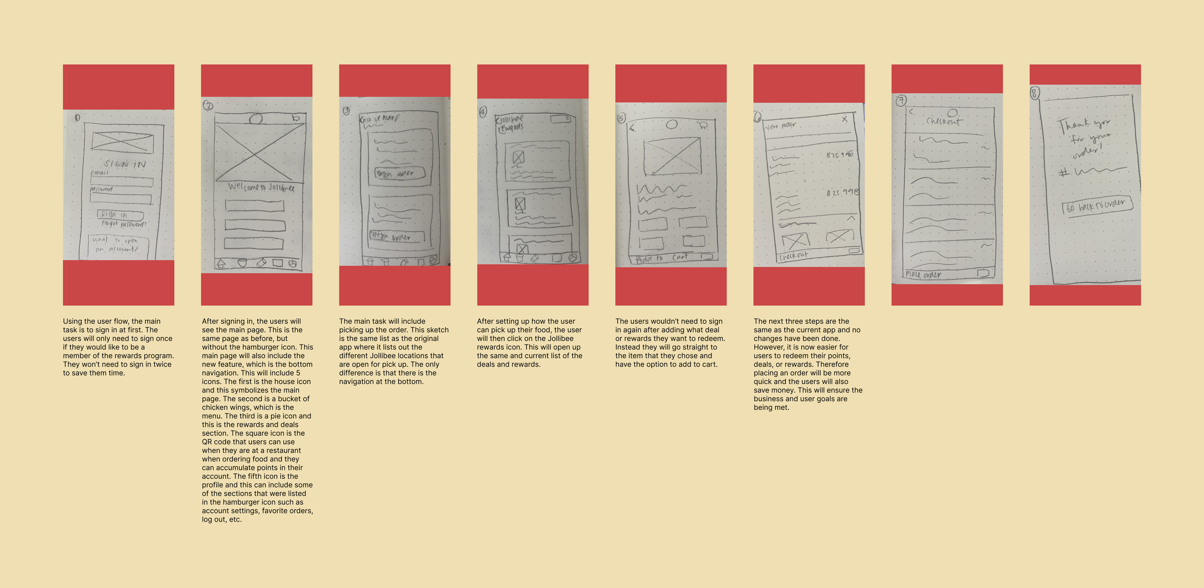
Lo-fi wireframe sketches — click to enlarge
"Took away the hamburger icon on the top left corner. Add place order button to differentiate between the cost to avoid confusion. Switched the pages for the Jollibee rewards from being in the home button into the jolly rewards button. Took away the navigation bar on the choose location to avoid... the users from going into a new section... I've also added the back icon on the location."
"From the usability testing, there were 2 errors. I have edited the gravy order on the Place Order page. The other error was not having the sign page pop up after the rewards page (if they bypass the menu main location page). This change will be done in the prototype. I won't put in the option to click on the Jolly Rewards icon/page on the prototype so this will not cause further confusion."
Color palette: Red, Yellow, White, Gray, Black. Typeface: "Vaground" Bold at 4 sizes. Icon set: a 3-state (red/gray/yellow) icon system built for the new bottom nav bar.
Goal: Get a comprehensive evaluation from the users and identify the main pain points that will help resolve the next steps of improving the Jollibee app.
3/5 initially went straight to adding rewards to cart.
2/5 went back and forth between menu and main page, taking longer to check out.
4/5 found the "place order" button confusing because the price was more visually prominent than the button itself.
5/5 couldn't scroll down to see the rest of the menu or rewards options.
4/5 clicked menu → rewards and were automatically taken to the rewards page, skipping sign-in — a bug to fix, not a feature to keep.
Lengthen the menu/rewards pages so users can scroll the full list; make the Place Order button visually distinct from the price; auto-route to rewards sign-in if not already signed in; remove the nav bar from the sign-in and begin-order pages.
All the users completed the task flow of going through the navigation bar to make their order. The length of time to complete the task ranged from 2 - 4 minutes. There were 2 users who came across an error of confusion. One of the errors was that the included condiment, gravy, wasn't included in the last order page when it did on the place order page. The other user was confused about going through the menu and then the rewards page without having to enter their location on the first page. The overall experience was rated to be an easy and simple navigation and they were able to find their way through the end of the task.
I will go back and add the gravy order for consistency. I will also need to link the Jollibee rewards page to the location page after they've logged in if they haven't done so.
[This section hasn't been written yet — it's yours to draft. Consider: if this shipped, what would you track, and what's the realistic impact? The Project Goals board (retention rate, conversion rate, brand reputation) and the Problem Statements' business-consequences paragraph are there if useful as a starting point.]
Working on the add a feature project has given me insight on how it would potentially be like if I worked in the industry. If I were to work for a company, many of their UX assets have already been created and set in stone. A part of being a UX designer for that company is to be flexible and malleable to what the product is and help to improve its performance.
The most enjoyable part about this project is seeing the reactions of the users when they tested the new added feature. Observing their delight at the improvements of the product gave me the reassurance that I needed. I also really enjoyed the hands-on aspect of creating and making the new feature. It's as if I'm building a lego set and I get to see the final product be useful towards the user/customers.
The main challenges when working on this project was finding features to work on because there were so many things that the app could receive additional upgrades. I also screenshot how the app looked and the day after the app completely updated. I was able to screenshot the main pages that I needed, but I forgot to screenshot extra pages... For instance, having a full view of the menu to scroll down would have been nice to have.
How to make the process to order food more quicker while adding from the rewards program... it would be best to make a navigation bar feature.
I can't think of many trade-offs that I had to make for this project. This project was quite straightforward and all the deliverables were easy to meet.
This project was a great opportunity to get a better understanding of how industry standards and processes work... Another takeaway is finding how to segment and compartmentalize each deliverable. By understanding this, this will prepare me for future projects by not getting overwhelmed.
